Abstract:
This article explains the importance of applying emotional color factors in the design of digital products’ appearance and packaging. By analyzing the development of emotional color factors and the direction of color design in digital product packaging, the article explores principles for applying emotional color in this field. Addressing current shortcomings in color design for digital products, it proposes personalized color solutions. The rapid pace of urbanization and people’s desire for a more natural lifestyle have led to increased attention on emotional color application, making it an important topic in digital product design.
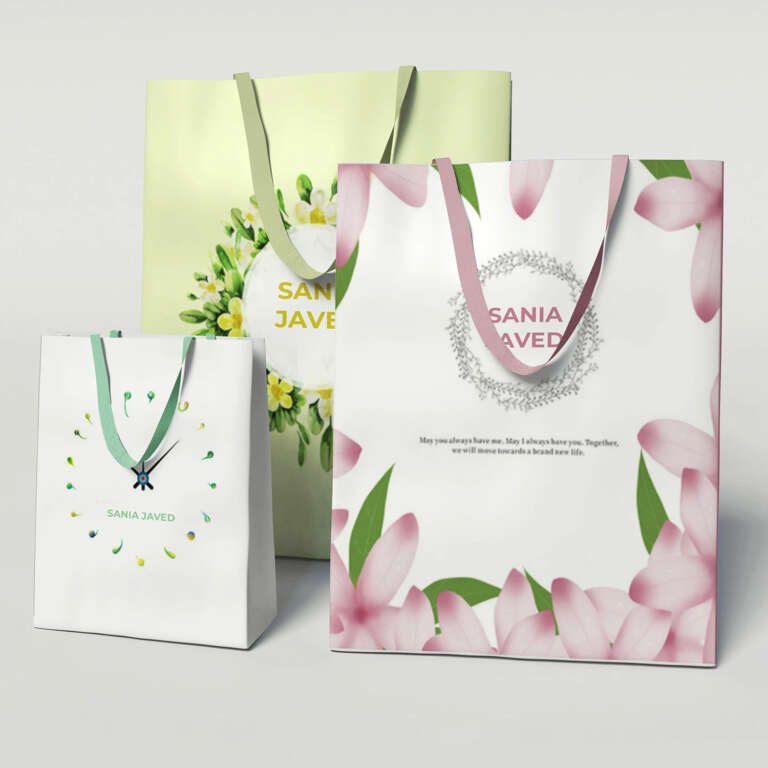
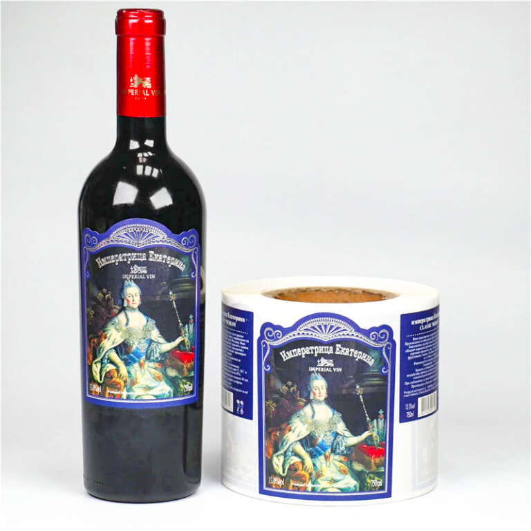
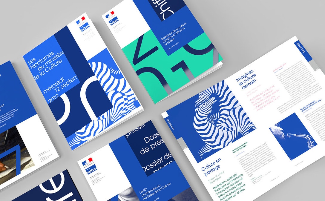
In custom packaging design, visual decisions must also work in real printing and finishing. Color, typography, pattern, logo placement, foil stamping, embossing, spot UV and die-cutting should be checked during artwork review so labels, boxes and bags remain consistent in production.

Keywords: Color; Emotional factors; Digital products; Packaging design
Introduction:
With the advancement of technology, the physical size of digital products continues to shrink while the need for proper packaging grows. Packaging is essential to fully convey the features, quality, and advantages of a product. Moreover, an aesthetically pleasing color design enhances the product’s value by meeting consumers’ emotional needs.
The first element consumers notice about a product is often its color. A well-designed color scheme can give a product a competitive advantage from the start. However, digital product designs are often dominated by neutral, monochromatic schemes that fail to address consumers’ emotional needs. As a result, applying emotional color elements to the design of digital products’ appearance and packaging is increasingly important.
1. Initial Stage of Emotional Color Application in Digital Product Design
In the early stages of production, products were designed mainly to meet functional needs, often overlooking emotional aspects. This era saw products with simple, basic appearances. As society evolved, blue tones became popular due to the emphasis on knowledge and technology, giving rise to the trend of “tech blue.” In the 1990s, neutral tones such as black, white, and grey became synonymous with high-tech sophistication, especially in home electronics like cameras and audio systems. However, little consideration was given to emotional factors during that time.
2. Development Direction of Color Design in Digital Products
In the fast-paced, post-industrial 21st century, consumers face heightened stress and pressure. Traditional color schemes that represent high-tech sophistication, such as monochromatic palettes, contribute to a sense of coldness and detachment in digital products. This only amplifies users’ stress when interacting with these devices.
Therefore, modern color design must address consumers’ emotional needs. Emotional color design can help alleviate stress and create a more user-friendly experience. For instance, Apple’s introduction of colorful computer casings broke the monotony of grey tones and met the emotional desires of different demographic groups. Older users preferred more subdued colors, while younger users were drawn to bright, vibrant shades.
3. Principles of Emotional Color Application in Digital Products
(1) Break away from traditional design misconceptions and focus on user-centric design:
Digital products should break free from conventional monochromatic schemes and embrace colors that resonate with consumers’ emotions. Products like computers, which are essential tools in everyday life, often elicit negative emotions due to their cold appearance. To counteract this, companies should design digital products that not only function well but also evoke positive emotional responses. For example, Lenovo’s “Disney Series” Y330 laptops combined a white body with whimsical, colorful patterns, bringing warmth and emotional appeal to high-tech devices.
(2) Tailor emotional color design based on product type:
Different types of digital products require different color schemes to highlight their specific features. For example, Nokia’s XpressMusic series used black with red accents to emphasize the vibrancy of music. This color scheme effectively differentiated the product and resonated with the target audience’s emotional desires.
(3) Customize color design according to consumer demographics:
Digital products have distinct market segments, and the color design should reflect the preferences of specific age groups or professional backgrounds. For instance, older consumers may prefer warm, calming colors, while younger consumers might be drawn to dynamic, passionate tones. Sony’s NW-E013F mp3 player was designed with five colors appealing to female users, demonstrating how color can communicate the product’s intended message and emotional appeal.
(4) Emphasize nature-inspired, eco-friendly color schemes:
As urban life becomes more hectic, consumers long for a return to nature. Digital products can respond to this desire by incorporating natural, eco-friendly colors into their design, creating a more emotionally comforting experience. This approach helps counter the cold, industrial look of many digital devices and brings a sense of warmth and connection to nature.
4. Conclusion
Color design plays a crucial role in the appearance and packaging of digital products. By incorporating emotional color factors, designers can meet users’ emotional needs, reduce stress, and improve quality of life. As the desire for a return to nature grows, the study of emotional color application will become an increasingly important topic in digital product design.


Related Packaging Resources
Explore related Reding Packaging product options for custom materials, printing, finishing, samples and export production.
For a project-specific recommendation, send size, material, artwork, finish and quantity details through the Reding Packaging quote form.