Just like the use of color, mastering the composition techniques in packaging design involves a variety of methods. The relationship between color and composition is interdependent—color serves as the foundation, while composition is the process and the ultimate goal. Therefore, composition is key. Alongside mastering certain techniques, it is also essential to focus on the visual effect, which is the final aim.
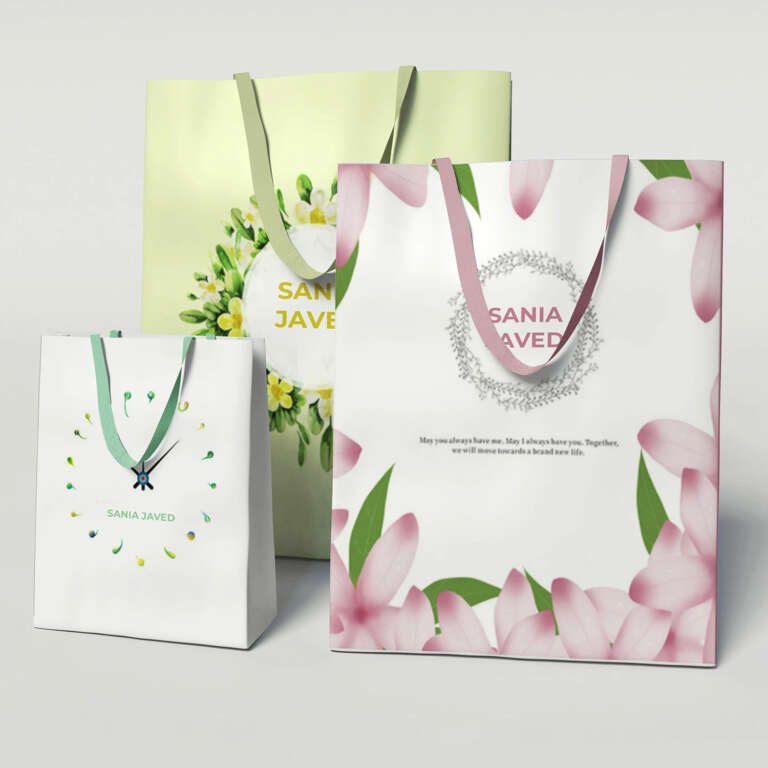
In custom packaging design, visual decisions must also work in real printing and finishing. Color, typography, pattern, logo placement, foil stamping, embossing, spot UV and die-cutting should be checked during artwork review so labels, boxes and bags remain consistent in production.

Below are several important aspects to consider when mastering composition techniques for packaging design, in addition to understanding color contrasts:
- Contrast of Thickness in Composition
The contrast between thickness refers to the style that emerges from the combination of colors and patterns used in the composition. In traditional painting, there is often a distinction between fine, detailed work (gongbi) and freehand brushwork (xieyi), or a combination of both, like in the famous works of Chinese artist Qi Baishi. In packaging design, a similar method is often employed. This contrast can manifest in different ways: between the main and supporting patterns, between central and background designs, or between bold and delicate strokes. For example, in food and beverage packaging like dumplings or shampoo, you’ll often see these contrasts effectively applied. - Near and Far Contrast in Composition
Similar to traditional landscape painting, where foreground, middle ground, and background are essential, packaging design also requires layers of visual hierarchy. The “near” part of the design refers to the element that first catches the eye—this is often the most important part of the packaging, the main selling point or brand name. For example, in early designs for Shuanghui’s instant noodle packaging, the logo and brand name stand out the most, followed by descriptive text, product images, and then secondary elements like mascots or slogans. This layering creates a clear visual structure, making it easy for consumers to grasp the key message at a glance. - Sparse and Dense Contrast in Composition
This contrast is similar to the concept of simple versus complex color usage. In traditional Chinese painting, this is akin to the use of “flying white” or areas where the brush barely touches the paper. In packaging design, areas of dense detail should be complemented by open, sparse spaces to avoid overwhelming the viewer. A well-balanced design should have clear focal points, rather than being overly cluttered, which could lead to visual fatigue and even deter customers. - Static and Dynamic Contrast in Composition
This technique involves the interplay between stillness and movement within the design. For instance, you might see a dynamic, explosive background pattern behind a product’s name, or a few intentionally chaotic brushstrokes surrounding the main text. This contrast between the lively and calm elements prevents the design from feeling too dull or overly flashy, resulting in a more harmonious and appealing visual effect. - East and West Contrast in Composition
The combination of Western cartoon styles with traditional Chinese art forms is a popular approach. Mixing Chinese artistic elements like calligraphy with Western imagery or text can create a striking and memorable design. This method is often used in products for children, clothing, or cosmetics packaging, where the blend of cultural elements appeals to a wide audience. - Old and New Contrast in Composition
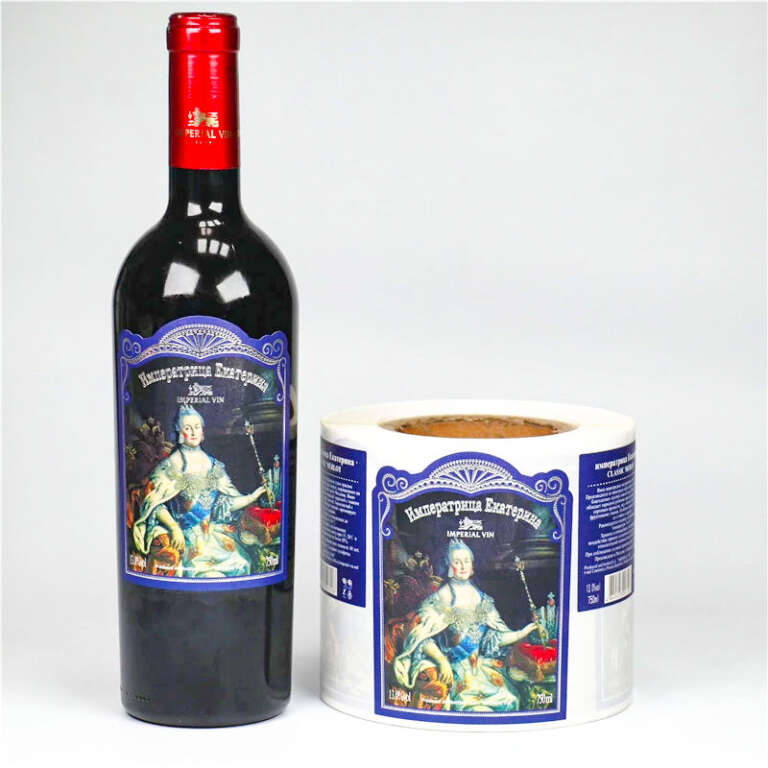
Just as there is a blend of East and West, there is also a mix of the old and the new. Many packaging designs use classic elements, such as traditional patterns, calligraphy, or historical figures, to evoke a sense of cultural depth and nostalgia. This technique is especially common in wine and food packaging, like Mid-Autumn Festival mooncakes or traditional Chinese snacks. It can also be seen in high-end cosmetics and gift boxes, where incorporating antique design elements gives the product an air of elegance and sophistication, which resonates with consumers.
By understanding and applying these composition techniques—whether through contrasts in thickness, distance, density, movement, cultural elements, or the blending of old and new—designers can create packaging that not only catches the eye but also resonates deeply with the target audience.


Related Packaging Resources
Explore related Reding Packaging product options for custom materials, printing, finishing, samples and export production.
For a project-specific recommendation, send size, material, artwork, finish and quantity details through the Reding Packaging quote form.