In brand design, color selection is essential because it is closely tied to a brand’s identity. For instance, Shanghai Meiyu Brand Design Company uses magenta as its brand color. Magenta, a blend of orange’s softness and red’s intensity, represents joy and vitality, reflecting the vibrant nature of Meiyu Brand Design.
In custom packaging design, visual decisions must also work in real printing and finishing. Color, typography, pattern, logo placement, foil stamping, embossing, spot UV and die-cutting should be checked during artwork review so labels, boxes and bags remain consistent in production.

Colors play a significant role in brand design, which is why it’s crucial to understand the basics of color psychology before defining a brand’s color scheme. Once you understand why certain colors evoke specific emotions, you can harness the power of color to communicate at a subconscious level through your brand.
Color psychology is a complex science that deals with how we perceive colors and how colors affect our thoughts and feelings. Colors are everywhere and have a huge impact on how we perceive our surroundings.
After black and white, red is the next color recognized by nearly every culture with a written language. Why? Because red is one of the most important colors in nature. It’s a natural stop sign—the color of an angry competitor’s skin. Red is not just a warning label, but it also signals ripe fruit.
However, color associations are not universal, and the meanings of colors vary widely across countries and cultures. In China and India, white is associated with death and funerals, whereas in the West, black carries this association. Similarly, yellow is considered a fun and joyful color in the U.S., while in Japan, it symbolizes courage.
Color associations can also shift over time. For example, while green represents rebirth and new life, in 18th-century Europe, it became associated with death.
As you embark on the color journey for your brand design, it’s important to consider which colors are best suited for your logo, website, or other brand elements. Understanding common color associations will help ensure your brand is remembered and stands out.
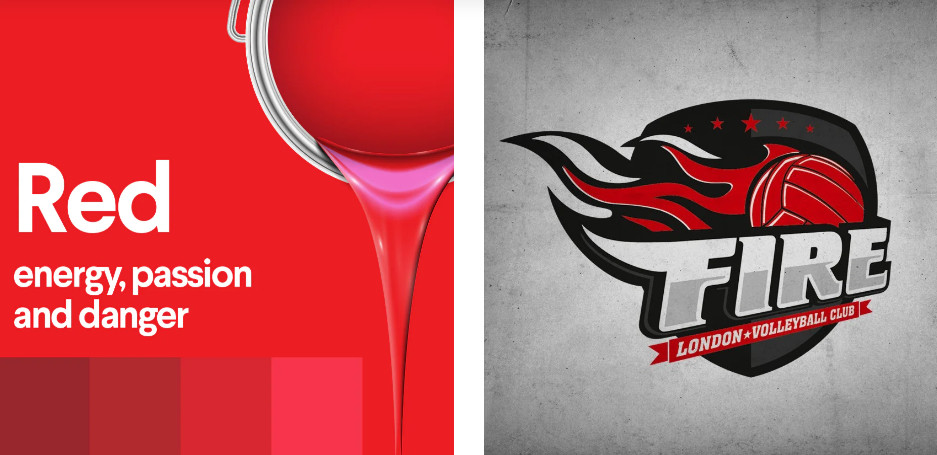
- Red represents passion, action, energy, and danger. Think of stop signs, flames, the Target logo, and roses.
- Orange is linked to creativity, enthusiasm, vibrancy, and youthfulness. Consider traffic cones, bright clothing, and juicy oranges rich in vitamin C.
- Yellow symbolizes joy, hope, playfulness, spontaneity, and positivity. Sunshine and smiley faces are prime examples of yellow.
- Blue conveys calmness and trustworthiness, often used by financial institutions and large corporations.
- Green is associated with nature, growth, and wealth. Think of trees and money.
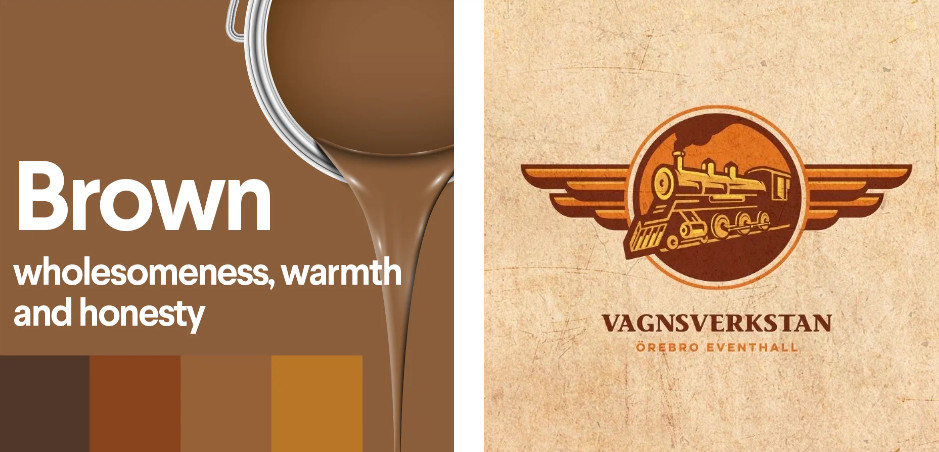
- Brown is a practical color, representing warmth, nature, honesty, and health.
- Purple is a mysterious color, symbolizing creativity, luxury, spirituality, and wealth.
- Pink represents romance, playfulness, and femininity, making it a youthful color.
Brand colors are powerful tools, and by applying color psychology, you can select the most suitable colors for your brand, ensuring it communicates effectively and leaves a lasting impression.


Related Packaging Resources
Explore related Reding Packaging product options for custom materials, printing, finishing, samples and export production.
For a project-specific recommendation, send size, material, artwork, finish and quantity details through the Reding Packaging quote form.